It’s weird, you know – talking about a Japanese logo one day, and stumbling across an apparent change to the IKEA logo type font that “erupted into controversy” – according to Houston Chronicle reporter Mary Tuma – the next.
Tuma poses an interview with Rice marketing prof Vikas Mittal: “…about ways companies can prevent brand blunders.” Mittal’s main point is that companies changing their logos really ought to consult with their customers first:
A typical redesign can take up to two years and cost $15 million to $20 million for a large company. Yet, there isn’t too much research done on how it affects their customers. Anything from size, typeface to color can trigger different associations…A lot of customers against this change see themselves connected to what IKEA represents – progressive, modern style. Changing the font jeopardizes all of those associations.
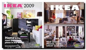
Fine except that it doesn’t appear IKEA changed the type font of its well-known logo. The company changed the typeface used in its catalogs, its corporate typeface, to Verdana from Futura.
Not logo change – body copy style change. Big diff – and virtually no difference at all, not in the grown-up world of life, the Universe and everything. It may be that some type designers and fans are strangely upset – one blog respondent said, “IKEA should change to Verdana. Futura is too good for IKEA, and they don’t really deserve to use it.”
There are several insightful explorations of the IKEA “font fiasco” online. Read the coverage provided by Jennifer Farley of Laughing Lion Design for a more complete review of what’s what. (The IKEA catalog cover images come from Brandacadabra’s Marius Ursache, who writes that “…as a designer, I feel betrayed.” Read his comments next.)
Gracious. I missed this minor outbreak of brand silliness amid the media’s far bigger reporting screw-up of the US Coast Guard’s Potomac River exercise yesterday. So, first, thanks to reporter Tuma for getting this “backlash” in front of me, even as I seriously question just how serious a problem IKEA really has.
Second, as even designer Ursache admits, “…this isn’t world hunger.” It’s not even worth a puff piece in the Chronicle. Ta for Saturday…
- September 12, 2009
- Retail